Week 2 Design Showcase
September 6, 2014
READ through each step so you don’t miss anything!
You Must:
- Create a background of your choice to serve as the tablecloth. (Color, pattern, image from Internet — your choice).
- Use the provided plate and remove the background to make the plate on a transparent layer.
- Then layer each ingredient of the sandwich in this order: bottom bread, lettuce, tomato, bacon, mustard, mayo, top bread. Each layer should be transparent, with no white/background.
- Rotate at least one ingredient.
- Create the mustard and mayo by using the brush tool.
- Each item should be on its own labeled layer
- Add typography of your choice somewhere on your design for an interim logo for Albert’s Grille. Those with advanced PS skills can take the opportunity to do what you’d like here!
- Save as a .PSD file and a .jpg and upload to Sakai for grading under assignments. Files should be saved as LastName_Week2.PSD etc.
- Don’t forget to post the .jpg as an image to your blog and include your write-up on your blog as outlined in the syllabus. The image for the web should be optimized. Remember to include tags.
You may want to make notes as you go along of the tools you are using to help you when you go back to write your blog post. (It’s easy to forget how you did something sometimes)!
Design Showcase Post:
Title: Design Showcase 2 – BLT Sandwich
Our first assignment was to create a bacon, lettuce and tomato (BLT) sandwich for Albert’s Grille in Photoshop, placing each ingredient on its own layer and in a specific order. Additionally, we were asked to place the sandwich on a provided plate graphic and a tablecloth of our own choosing, with a final font treatment of “Albert’s Grille” as the restaurant’s name.
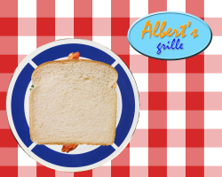 I started by creating my document with a 5 x 4 ratio (1,250 x 1,000 pixels) and placing a red and white checkered pattern tablecloth as my bottom layer. I liked the summer feel and “picnic” idea associated with a BLT sandwich. Next, I created a new layer for my plate.
The plate required me to open as a separate image and rasterize, as it was a smart object with another background. I unlocked and renamed the background layer and then used the Magic Want to select the background to remove. Admittedly, I struggled a bit initially with removing the background and not capturing the plate’s edge, as there is a gold rim to the plate’s design.
I then drag and dropped the plate into my working file, creating a new layer which I renamed as “plate.” I scaled the plate accordingly and placed in the lower left side of the document.
For the next four layers (bottom bread, lettuce, tomato and bacon), I opened each file separately, rasterized as needed, and used the Magic Wand tool to remove any background or drop-shadow elements. I dragged and dropped each layer into my working document, placing each into the appropriate order. I decided my sandwich needed two tomato layers (one just didn’t seem like enough), so I duplicated the tomato layer and placed each element accordingly. Additionally, I rotated the bacon approximately 45 degrees to add an organic feel to the sandwich construction. Throughout this process, I was able to refine my Magic Wand selection process while holding the SHIFT key to add to the active selection.
Next, I created two new layers ﹘ one each for mustard and mayo ﹘ and used the brush tool with two different colors, pixel sizes, and hardnesses to create the final toppings. To complete the sandwich, I duplicated the original “bottom bread” layer and made as a “top bread” layer and placed at the top of the stack.
To organize my file, I placed all the filling layers into a group titled “Fillings” and had that organized between the two bread layers, accordingly.
Finally, I created a quick logo for “Albert’s Grille” using the Text tool. I chose a blue and orange color palette and selected a script font that felt non-formal to the restaurant’s brand, given the menu item. I used a smaller point size for the word “grille” and placed the word all in lower-case text to help soften the brand, while also decreasing the leading between the two words to tighten up the two rows. I placed an Outer Glow and Drop Shadow to the text, to help it pop against the last layer I created; an oval shield behind the “Albert’s Grille” text. I chose a light blue – almost cyan – as the shield color to help it pop off the red and white checkered table cloth background and that somewhat compliments the other colors. I applied a Bevel & Emboss effect to the oval shield to help it lock-up with the text and create a logo, using the vertical and horizontal align functions. The last step was combining these two layers into a group titled “Albert’s Grille logo” to organize. This group was then placed at the top of my layers panel.
Overall, the assignment helped me to understand using the Magic Wand and Brush tools, while also getting a stronger understanding of the Layers structure of Photoshop. I’d still like to get stronger with using the Magic Wand and Brush tools, but I have a good idea of their purpose and how to use at an elemental level.
Post Tags:
Design Showcase, Photoshop, VIC5325,