Week 5 Design Showcase
September 26, 2014
Instructions
The goal with this week’s assignment is to not only sharpen those PS skills, but to showcase your understanding of IMC.
Design
- For this assignment, choose one of your favorite brands that is currently using an IMC strategy across multiple channels.
- Design an 800 x 600 pixel image (or 600 x 800 pixel image if you want to make it vertical) that your favorite brand could ideally use, keeping with the look and feel of their current IMC strategy.
- Your design should have the logo of your chosen brand on it.
- (tip: to find a logo, try brandsoftheworld.com; or google.com and search for “‘your chosen brand’ logo”, click images, and then search tools to bring up “size.” This way you can search for medium/large logos to work with so they don’t become pixelated on your design).
- Layers should be organized.
- Use at least one layer style on your assignment
- Design must include some form of copy (text) that relates to current IMC strategy as well. This could be a description, a call to action, a slogan — it’s up to you.
- Design must include at least one mask.
Blog
- On your blog, make sure to add a disclaimer you are not affiliated with the brand and this is for educational purposes.
- Share your thought process on your design and include a web optimized jpg (you may need to resize if your image is wider than your blog width).
- To help us see why you designed your graphic the way you did, include at least three (3) images/screenshots of the channels your brand is using so we can see the design strategy within their IMC campaign. Include links to the brand’s channels for easy navigation for your readers.
For our design assignment to showcase an Integrated Marketing Campaign, I selected MINI Motors. This is a fun, energetic, “trendy” brand element that keeps a tongue-in-cheek spirit to their creative and advertising. I decided to build a graphic that features an expansion from a headline in a Facebook advertisement. I’ve also included several sample ads that I took inspiration from when I started my creative.
 First, I created the file with the dimensions requested and unlocked the background layer to fill with black; the signature background of MINI. Because blue is one of my favorite colors, I selected a blue vehicle to build from. With that selection, I created a blue frame in a new layer and centered the frame within the black background. MINI uses the highlighted vehicle’s color and apply to the frame element.
Next, with a new layer I dropped in the headline text of “KEEP CALM AND MINI ON.” which is the preferred capped headline treatment. MINI uses a customized font for their advertising titled “MINITypev2BoldRegular.” This appears to be a proprietary font, so the closest selection I could find was Arial Black with a reduced tracking of -25 to tighten the letters together. Their headlines also end with a “.”
I then placed the Cooper S car image I obtained from the MINIUSA.com website onto a new layer and scaled the image to fit. I moved it to the lower right of the canvas. I had to adjust the layer order to to ensure the car image was below the headline and frame.
For the MINI logo, I located the logo from brandsoftheworld.com and placed the .eps vector image into a new layer. I again scaled down and placed in the lower left of the canvas within the blue frame. I then added a new layer with text for the car type and the company website. I justified right and placed below the car image above the frame. To make the logo have a bit of depth, I added a drop shadow effect, adjusting the color to white, the opacity to 30%, the angle to 110 degrees, and the distance to 4 pixels.
I chose not to use a subhead or any additional ad copy as I felt the headline and imagery spoke to the ad’s brand. Most executions of the IMC for MINI feature just a singular headline.
Finally, I placed my last image of the recently trendy “Keep calm …” crown in the iconic white directly above the headline. I scaled the crown image down and then centered it with the headline. I added a layer mask and placed a radial gradient from the center of the crown outward, thus adding contrast from the center to the edit. The effect added depth to the crown overall.
Overall, I feel like this ad could easily live within the MINI IMC of Motor On and is a reflection of their fun, spirited brand essence and identity.
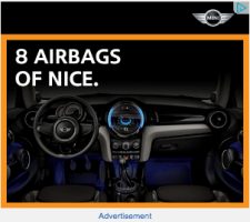
Original Design Samples:

Display Ad 1
Display Ad 2
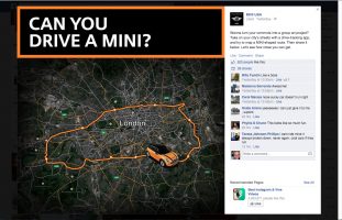
Facebook Post

Sample Creative

Sample Creative

YouTube Channel
This posting is by no means commercial or is intended to reflect an commercial activity for MINI USA or BMW Automotives. The original creative showcased here is purely for educational purposes and is designed as such. Non-commercial use only. I am in no way affiliated with MINI USA, its parent company or any subsidiaries. I’m simply a MINI enthusiast who also enjoys creative and web design.
Post Tags:
Design, IMC, Integrated Marketing Campaign, MINI, MINI USA, VIC5325,