Week 6 Discussion Post
October 1, 2014
- What makes a successful logo?
- Share an example of a local business in your area that you feel has a great logo. Why do you think it works? (Make sure to include the image of the logo)
(No penalty if you decide to also use major brand logos as examples in your answer for question 1 if you’d like to do so in order to support your viewpoint).
A successful logo, as we’ve discussed in class, is memorable, simple and unique. It should convey the essence of a brand in that it should be able to stand alone from a company’s creative, but also be flexible enough to fit executions across all marketing and branding media.
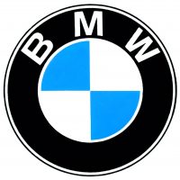
One example of a brand that has a logo that speaks to these fundamentals is BMW Group. Their traditional black, blue and white logo was thought to symbolize the movement of a airplane’s propellor (the blue within) and tied to the heritage of their engines. This “logo lore” has received mixed reviews of late as historians have found several different variations on the inspiration of the logo came into being. Blog articles by NYTimes.com and LogoDesignLove.com have shared alternate histories. Regardless, the design and passion is actually shared with all new customers as a hallmark of the brand and what it means to own “The Ultimate Driving Machine.” The debate about the history of the logo in and of itself is evident of its international brand recognition.
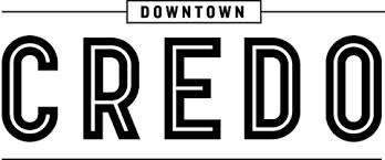 One local organization that I really respect and enjoy their logo choice is Downtown Credo. They are located on the northwest side of Orlando and carry the spirit of the local community. It’s a coffee shop that features plenty of open space for guests to work, network, or just hang out. It features no set pricing, but suggested costs for their simple menu of items. Additionally, the shop hosts events on the weekends that help support local organizations and charities.
I’ve really enjoyed this logo since the shop first opened. It feels clean, elegant, but not pretentious given their cause. The thin lines that frame and add emphasis to “CREDO” as if to instantly call attention to a centralized cause. Additionally, the font selection is choice in that the open lettering (or black stroke on white letters) adds a sense of historical credence to their brand and mission.
Overall, I think it works for their purpose and goals providing an anchor in their community and serves recognition to their cause.
Post Tags:
BMW, Design, Downtown Credo, Logo, Logo Design, VIC5325,