Week 7 Design Showcase
October 12, 2014
Instructions
We are getting into website/web imagery planning now! Let’s start with a moodboard.
Design an 8 x 10 inch (or 10 x 8 inch) high resolution moodboard in Photoshop that you could print out and put on your wall for some inspiration.
- As discussed in class with the criteria you should consider: choose a brand to create a moodboard for. It could be your own personal brand/website you want to create someday, it could be for a campaign you are working on for your job, it could be for a campaign you think your favorite brand should run. Up to you!
- Your graphic should contain at least three photographic stock images (not previews of them, so they should not be watermarked). You can find freebies at Graphic Leftovers or check this week’s discussion board for your classmates’ suggestions. I do not expect you to pay for any graphics to complete this assignment.
- Your graphic should contain this year’s Pantone color of the year plus two others from a previous year of your choice (see this webpage for all the info you need: Pantone Colors of the Years) . You can use the Pantones in any way you’d like (color replacement, small text, large text, as part of your moodboard itself, shapes etc), but you must create color SWATCHES within your .PSD for the ones you choose, and label them accordingly (i.e. 2014-radiant-orchid). ©
NOTE: These colors should be found under the new PhotoShop versions. If you can’t find them in your swatches, or on a platform older than CS6, a few clicks around the site will give you the proper formulas/codes you need to create the colors. I found them under links called color announcements for each color. (Look for PLUS series, as Pantone colors are listed differently for different materials like plastic, paint etc).
- Apply any Action to any portion of your graphic.
This shouldn’t be a haphazard collage of images just placed in a document. It should be laid out with a definite design like the examples shown in class or the ones shown on this class’ required reading/watching this week. (video under lessons). This assignment goes beyond just what’s ON the moodboard, but how you DESIGNED your moodboard as well. That being said, templates are not allowed.
I will be assessing everything above in addition to layer organization and overall use of PhotoShop.
On your blog:
- Place a web-optimized jpg and describe the process you took with your design.
- Also answer: what are the RGB and CMYK equivalent values for your chosen Pantone colors.
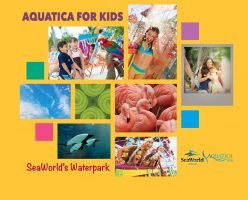
In determining what my mood board would be designed around, I looked to my previous work experience for ideas. I landed on creating a mood board for Aquatica, SeaWorld’s Waterpark Orlando to develop a fictitious Kids Free ticket promotion.
Per the assignment, I located the 2014 Pantone color of the year, and also selected years 2013 and 2008 as I felt they were complementary to the existing Aquatica color palette.
| Pantone Color | CMYK | RGB |
| 2014 Radiant Orchid | C: 29 M: 69 Y: 0 K: 0 | R: 181 G: 107 B: 172 |
| 2013 Emerald | C: 99 M: 0 Y: 69 K: 0 | R: 0 G: 168 B: 128 |
| 2008 Honeysuckle | C: 0 M: 86 Y: 16 K: 0 | R: 239 G: 74 B: 135 |
With my intention on finding ways to promote how Aquatica is a kid-friendly waterpark, I started sourcing images. For my stock images, I selected photos and a texture that reminded me of the experience of Aquatica and how it’s affiliated with SeaWorld.
Next, I sourced images from the brand library that featured both unique, key elements of the park, including the commerson dolphins, as well as family and kids, knowing the promotion would need to speak to moms and not marketing directly to children. I avoided any imagery that focused or suggested “sale,” or “discount,” or “free” as the brand itself speaks to fun, exciting, up-close animal encounters and experiences. It was the emotion of the brand of kids having fun, that I was aiming toward.
To start my mood board, I opened a CMYK file with the required specifications. I created my Pantone color swatches, and also my Aquatica colors from the DNA sheet. I then setup a grid to begin working, placing images at slightly different scales working from the center out. I created boxes of the color swatches to incorporate their feel into the design.
Without purchasing the necessary fonts, I used two similar on-brand fonts to add the text “Aquatica for Kids” and “SeaWorld’s Waterpark” to help frame the focus. I changed the background to the yellow from the Aquatica colors to help it feel more childlike in harkening primary colors.
Finally, I applied the Action I found online to convert a photo of a mom hugging kids into a Polaroid-style image.
Admittedly, I struggled with finding both free stock imagery of kids/parents, and the brand library was also lacking these types of assets. Overall, I think the fun, kids and family experience is present, and the colors add to the appeal of the park and the brand.
Disclaimer – this project is not related to any relevant work associated with SeaWorld Parks & Entertainment and is purely fictitious in nature. Any usage of logos or imagery is for education purposes and is designed for non-commercial usage.
Post Tags:
Image Board, Mood Board, Photoshop, VIC5325,