Week 8 Design Showcase
October 17, 2014
Instructions
Your client for this assignment happens to be your favorite restaurant. Your assignment is to design a wireframe with the following features for your client. The goal is a redesign of their website, not to wireframe their current site.
- You must design in PhotoShop.
- Grid lines/guides must be turned on to show how used them for alignment purposes.
- Your document must be 1280 x 972 pixels (you may decide not to design to the edges, which is fine).
- Include at least 3 color swatches (labeled); so we know the overall color scheme.
- Layers should be organized and labeled.
Spaces for:
- Logo
- Navigation menu
- Social media icons
- Rotating slideshow image
- Upcoming events/specials
- Three feature areas (pictures and/or copy)
- Contact Us area
- Another feature of your choice.
On your blog
- Place a disclosure this is for educational purposes; not affiliated with company you chose.
- Describe your rationale for placement of the assets you have designed spaces for.
- Why are certain items given priority over others?
- Make sure to share samples of what your color scheme would entail.
- Make sure to include a jpeg of your wireframe. (can resize for purposes of your blog width)
Submission
Submit your blog link and wireframe in .PSD and .jpg formats
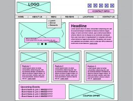
In this week’s design showcase, I selected Cafe Murano, local Italian establishment, to complete a new homepage wireframe.
I started by reviewing their current website, and wanted to make sure I highlighted some of the key items, including their menu, but also consolidating a few sections, like “Meet our Chef” and ‘VIP Club” into “About Us.”
I started by framing out my content to fit within 1000 pixels, thus floating it center on the page, as illustrated by the centered white frame.
I started work on the header section. I chose a light blue to illustrate images. I placed the logo in the upper left and labeled it as such. I decided to place the social icons in the upper left of the page, and chose a specific color to illustrate the five top social networks. Below those icons, I placed a text box to feature contact information; phone number and email. For the text box, I chose a light pink to illustrate a text box/frame.
Each of these sections’ layers were grouped together and then placed into a “header” group.
I then worked on the navigation. I drew a grey box to demonstrate the navigation lock-up. I then placed a text box with suggested primary navigation options and also drew a drop-down mock-up under the “MENU” section.
From here, I moved down on the page and created the carousel image gallery feature on the left. I added left and right selection arrows, which would help with tablet users, and also added a visual cue to the user in the lower portion with the three circles to demonstrate to the user if there are more than one image available. To the right, I placed the primary copy and headline which is intended to showcase the restaurant, its style and what it’s know for in cuisine. This section carried the existing color selections from the Header section.
As I continued to build out the page, I added three feature sections below the gallery and headline text. These are marked off with grey boxes to illustrate a true “boxing” effect of each element, which then within contains an image header and text box. Each of these boxes would highlight a specific content section of the site, such as seasonal menus, live music, video info, or other specials and promotions.
Below this section, I created a second two-column layout with an Events text section on the left, and an image for a coupon/offer on the right.
Again, this section repeated the same color identity from the previous sections and the layers were grouped accordingly with color coding for additional distinction between the Header and Content sections.
I believe the structure of the new wireframe brings the most important content and information to the forefront and highlights it appropriately and effectively. While the current site for the restaurants is visually appealing, it’s almost distracting in its multitude of content and also lacks quick ease to location and contact information. I believe the wireframe I’ve created would assist in increasing the company’s brand awareness and could help drive additional guests from the web page to the restaurant locations.
Disclaimer – I am in no way affiliated with Cafe Murano, its owner or subsidiaries. This exercise is purely for educational purposes and any usage of the name, logo or details is entirely for non-commercial use only.
Post Tags:
Photoshop, VIC5325, Wireframe, Wireframing,