Week 10 Design Showcase
November 1, 2014
Instructions
This week, you are designing an email for the brand campaign you used in Week 9’s banner ad assignment. You are tasked with preparing a first quarter (2015) promotional email for them.
Design
- Design your email with recommended size specs as discussed in class.
- Your email should clearly represent the same campaign and be in line with the current brand standard of your chosen brand.
- Your email:
- Must have a logo, clear promotion and a call to action.
- Have some type of navigational header
- Use at least three images (in addition to logo)
- Have two additional promotional copy blocks than what appears in your banner ads. (You will have to write some brief promotional copy- grammar and spelling matter!).
- Note: one should probably be for your promotion– the other can be for something else like: free shipping, redeem gift cards etc
- Have a footer
- Have contact information
- Use at least 3 social icons
- At least two other features of your choice are required (sign up box, another small promotion)
- Text for:
- unsubscribe
- A way to easily share the email.
- A statement to view in a browser.
- You will then slice your email design and prepare it for the web (Shown in Thursday’s class).
Note:
- No items should be pixelated.
- Some of the required items can be combined (i.e. social icons or contact info can be in header or footer)
- UI elements could be used buttons and icons, but not anything else.
- Refer to this week’s discussion board and samples in Powerpoint for some ideas! The L.L.Bean, Diapers.com, and ModCloth examples have almost everything listed here and are good examples.
Blog
- Save a .jpg of your email and place on your blog
- Should be web optimized for quick load times.
- Make sure you have a disclaimer on your blog this is for educational purposes etc.
- Make sure to tell us about your design thought process . Did you sketch an idea first? Was there a design element you chose to create that was more time consuming than you thought it might be?
Submission
Submit one (1) .PSD file with layers organized as much as you can and with slices in place.
Submit your jpg as well
Link to your blog post.
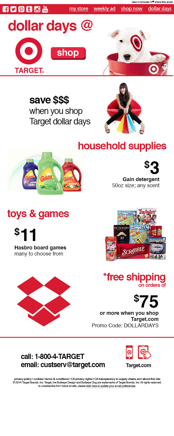 Design Showcase 10 asked us to extend the design work from week 9 by activating our promotion for the selected company via email. Working with the specifications provided during lecture, I created an email announcing Dollar Days at Target. I assumed my audience would be existing subscribers of Target email marketing communications and would be interested in learning about the latest retail promotion.
I started by creating a blank file 600px wide 72 dpi and 1500px for height, depending on how my layout came together. I started by creating the top navigation row, first by creating a red box 35px high and full width. Leveraging the fontawesome tool, I created the relevant social icons and place them to the left. I then created four logical navigational elements and placed them to the right in the red bar.
Using the creative from the week 9 banner ads, I dropped in my headline, target logo, shop button, and target dog photos in my promotion heading. I spaced them to fill the area intuitively. Next I worked on the specific offers to be included in the email. I decided to go with actual products that could be purchased online and instore, including a household item and toys. I decided to go with the “S” format of content, alternating image with headline/text for each row/promotion.
Selecting Gain laundry detergent and Hasbro board games, I thought these two would provide creative different to the Target red, black and white so far used in the creative. Additionally, I chose whole dollar amounts for the products given the “dollar days” promotion. I also added in some of Target’s formatting throughout the message which is a lowercase text in all instances except the Target name.
For the third offer, I selected a shipping offer to help drive consumers to shop online. Again, I used fontawesome to locate a shipping box to use for the graphic, recolored to Target red.
Working to space out the message, I then added some additional room between each row/offer. Finally, I added a last row of contact information and graphics with the Target.com URL to encourage fans/subscribers to call or go online to learn more about products, the promotion, etc.
Finally, I added the footer including the copyright, the same privacy policy, terms of use, and unsubscribe details. I then shifted all the content down about 10 pixels to add at the very top the “view in browser” and the opportunity for a recipient to “forward to a friend.” I then applied slices to my .psd file, but would assume that had this been actually coded for email distribution, I wouldn’t have slided out the copy but would have coded these sections for active/live text.
Overall, the assignment was fun in researching a bit more how Target extends its brand to digital communications. Additionally, pulling together the different parts and pieces was interesting. I think the the most challenging part was aligning the content vertically so that it was spaced evening and consistently. I enjoyed locating retail products to showcase and bringing together real elements from the Target site, such as their App creative, to make the piece feel authentic and real.
Disclaimer: this post and associated images/creative are purely for educational purposes only and not intended for any commercial use. I am in no way affiliated with Target Brands, Inc.
Post Tags:
Email Design, Layout, Photoshop, VIC5325,