Week 12 Design Showcase
November 14, 2014
Instructions
Make sure to watch the required videos posted under Lessons to give you ideas on how to use PS to design an infographic/use the pen tool for infographics.
Design
Choose to create an infographic based on the information from either Article A or Article B, two recent articles in the news. Article A has more data and fewer categories, while Article B has more categories, but less data.
Article A: The US Falls Behind Nicaragua, Rwanda, And The Philippines On Women’s Equality
Article B: 8 Food Myths You Probably Believe
Your infographic must include:
- There are no size parameters, but design for web use.
- Use of the pen tool
- Must use at least 5 graphics and/or icons to represent data results (can use more if you’d like).
- Cite your data/references within your infographics. (You may cite the article itself, or follow the links to the data the author provides to dig deeper on stats and cite those).
Blog
Provide your infographic as a web-optimized .jpg.
Link to the original article in your post [make sure you have your disclosure statement you are not affiliated with the author(s), and this is for educational purposes].
Tell us your thought process behind the infographic.
Did you look to other infographics for inspiration?
Did you sketch a wireframe?
Why did you decide to organize the data visually the way you did?
Where did you use the pen tool?
Submission
Submit your blog link, your PSD and a jpg of your infographic in Sakai.
——
Chosen Article – Women’s Equality
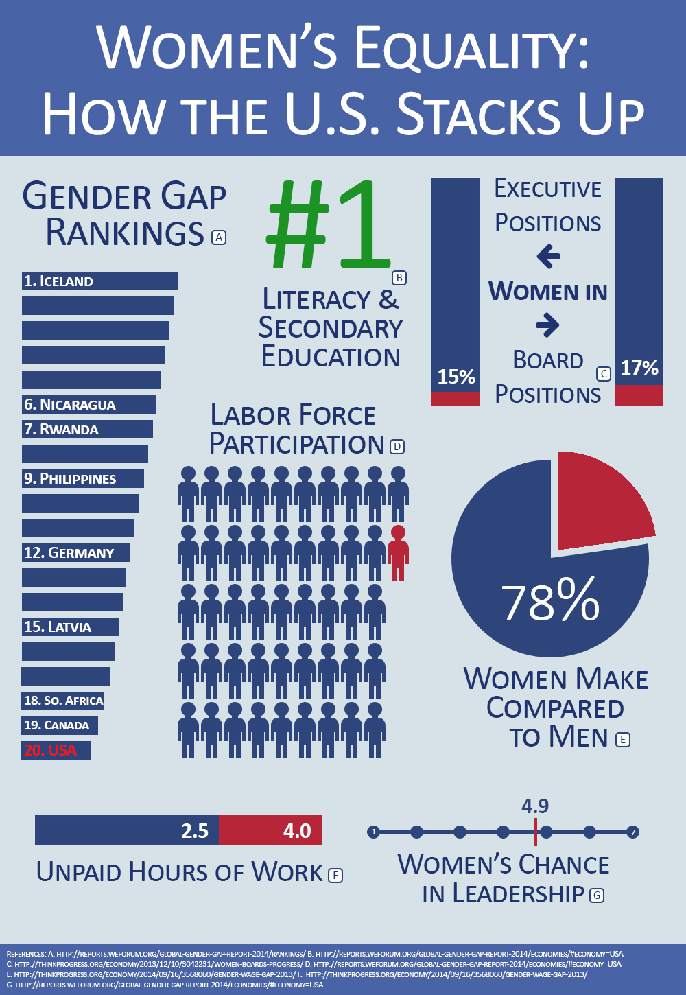
The United States moved up a few slots in the World Economic Forum (WEF) Global Gender Gap Report this year compared to last. But it still falls at number 20, behind less developed countries including Nicaragua, Rwanda, the Philippines, Burundi, and South Africa, as well as more developed peers like the Nordic countries, Germany, Ireland, Belgium, France, and Canada, among others.
The U.S. ranks at the top when it comes to educational measures such as equal school enrollment from primary education to college for girls and boys and the literacy rate. But it falls behind in many economic measures. It ranks at number 47 for equal labor force participation — 67 percent of American women are in the workforce, compared to 78 percent of men — and number 65 on equal pay for similar work. The average American woman who works full time, year round makes 78 percent of what the same man makes. American women also spend more than 4 hours a day, on average, on unpaid work, while men spend a little more than 2.5 hours.
One area the country falls down in particular is in paid family leave. Given that the U.S. doesn’t guarantee paid maternity leave, unlike nearly every country around the world, or paternity leave, unlike 70 other countries, it doesn’t get any points for measuring the length of maternity or paternity leave or the size of benefits. The lack of paid leave, along with low spending on childcare and a lack of support for flexible work arrangements, is part of why the U.S. has been falling behind on women entering the workforce over the last two decades.
It also ranks at number 16 for women’s share of legislators, senior officials, and managers. Given that a woman has never been president, the country ranks at number 64 for how many years we’ve had a female head of state and gets a score of zero. It doesn’t fare much better for women in other political positions — white men make up 31 percent of the American population but 65 percent of elected officials.
On a scale of one to seven, with one being the worst and seven the best, the U.S. gets a 4.9 score for women’s chances of rising to positions of leadership at the workplace. The WEF has credited other countries’ quota systems for increasing women’s share of top roles, but the U.S. doesn’t have anything like that — it just has a rule requiring companies to disclose how they consider diversity that’s so vague that it usually isn’t defined as relating to gender or race. Women make up less than 15 percent of executive officer positions at the country’s largest companies and less than 17 percent of board positions.
—————-
 This week’s Design Showcase had us tackling infographic creation. Admittedly, this assignment intimidated me, as I’m greatly impressed with the design techniques, skillsets, and capabilities necessary to take complex data and turn it into an easy-to-read flowing graphics that inform and educate. We were provided with two articles to chose from, and I selected the one regarding the United States recent slip to fall behind third-world countries as it relates to the gender gap between men and women. (The US Falls Behind Nicaragua, Rwanda, And The Philippines On Women’s Equality).
I started by copying the article to a document and highlighting the facts I thought would be able to translate into an infographic. I identified seven to nine facts that both seems relevant and impactful, but also could translate graphically. I thought back to previous infographics I’d seen/read, and figured I’d go with free-form thought via the sketch.
I started with pencils/wires (see sketch to the right) to determine which graphical treatment made the most sense for each fact. I knew I didn’t want to repeat a bar/column/chart/graphic for a second fact, and this process allowed me to align the facts to a visual layout.
Next, I needed to determine my fonts and colors. I knew I wanted something a bit “statistical,” but also had some feeling. Additionally, I didn’t want to go with the baby-blue/pink color theme that is typical of boy/girl or man/woman creative juxtaposition. Instead, I went with a palette similar to the red, white and blue of Americana.
I created a file in Photoshop that was RGB 72 dpi given the desire to share on the web. I created a light blue background and then placed another header box at the top with a headline layer of “Women’s Equality: How the U.S. Stacks Up.” I selected Calibri as my font family. I would use regular, light and bold throughout the document; leveraging bold most frequently for reverse text on the dark blue backgrounds.
I started making each data graphic element, working from left to right, top to bottom from my sketch. For the Gender Gap Rankings, I created 20 bars/rectangles and selected what I thought were key/interesting countries that ranked higher than the U.S. and placed them in the corresponding ranks with the U.S. in the 20th bar, and recolored it red to both make it pop, and to illustrate the low ranking.
I then moved on to the Labor Force Participation stat. Given this was a “labor” stat, I wanted to use generic “person” graphics to represent how/where the U.S. ranked. I started with an elliptical circle and then using the pen tool, pixel by pixel, drew out the character. Once I had my person, I colored it dark blue, which is usually attributed to male/men and replicated/duplicated to eventually create 50 persons. Merging the 50 persons into one graphic (the video from our lessons that showed how CMD-E merges selected layers into one), I rasterized the layer and erased the last four persons and then placed a 47th person in the same red color to illustrate the U.S. ranking.
Next, I tackled the best statistic of the U.S. leading the Literacy and Secondary Dducation of women. This is the only number and graphic that is in green, a symbolic rich, wealthy, correct, and leading color. I simply created “#1” as the graphic and resized accordingly.
My next stat was on the percentage of income the average woman makes in comparison to a man in the same role. I chose the pie chart, slicing out the discrepancy between the two and also coloring in red to illustrate the negative number. I used the pen path tool to remove the section of the ellipse that illustrated the variance in the statistic.
Moving on, I decide to tackle the Executive and Board Member statistic. This graphic probably varies the greatest from my original sketch, but once I built the bar chart and added the labels, I liked the idea of introducing the data label between the two bars, and using arrows (from fontawesome) to direct the reader to the corresponding statistic.
It was at this point, I wasn’t liking my overall placement of the graphics and also decided to increase my canvas size. I decided to move the “#1” to the center, given it’s the only positive statistic, and helped anchor the rest of the data. I resized and reformatted so that my last two graphics would be toward the bottom.
For those last two graphics, first I created a horizontal stacked bar chart for the unpaid work statistic. I then decided to create a line chart for the woman’s chance to rise to leadership statistic. These were then placed side-by-side to anchor out the bottom of the graphic; again, using the red, white and blue colors from the other graphics.
Finally, I duplicated the header box from the top and placed at the bottom, and added the URLs for each of the data points. I added a letter key to each graphic to identify which statistic/graphic corresponding to each source in the footer. Because, I had some extra space, I resized the canvas to shorten the total image size, and saved accordingly for this post.
I lost most of my intimidation after I started sketching and realizing I could successfully tackle the assignment. Also, the videos from this week’s lessons were very helpful, albeit fast-paced, to show some great quick shortcuts and to provide a sense of doability.
Post Tags:
Digital Layout, Infographic, Layout, Photoshop, VIC5325,