Week 14 Design Showcase
November 29, 2014
Instructions
Your assignment this week is to design one (1) screen of a mobile shopping app for the iPad.
(Due to Retina displays obviously wanting higher resolution, we are not designing for that purpose so it’s easier for you to find images for your assignment. If you’d like to design at 1536 x2048 you are welcome to).
- Design a shopping app for a real brand in the retail industry (clothing, cosmetic, home, toys… etc).
- Size: 1024px x 768px (or design vertical)
- Use guides or grids to help design
- Your design must have:
- iOS status bar (I’ve included one attached if you want to use that, or do a web search).
- Brand logo
- Navigation sidebar with at least 4 main buttons. One of these buttons, you will show how it will look when the menu is open (sub-menu options). Your sub-menu should have at least 5 options.
- An least 3 icons that are used in online shopping (think cart image etc.)
- At least 4 images of your product with text/copy that relates to your product (price, name). Should include someway for your user to make the purchase (button etc).
- Do your best to include some of the iOS app guidelines in your design.
- You can use UI elements for icons.
Once your app design is complete, replace the blank screen of an image with your design (as shown in class with the house example). You can find an image of your liking, or you can use the one attached (feel free to edit additional areas if you’d like i.e. add a border etc).
Need some inspiration, more how to? Check out: http://design.tutsplus.com/tutorials/create-a-mobile-shopping-app-design-in-photoshop–psd-32372 — However, you shouldn’t use the elements provided, look, layout structure etc, but it’s a good resource for some ideas on how they accomplished what they did.
Blog
Include your post is for educational purposes. Include the .jpg of your app design and the .jpg of your replacement screen image.
Tell us your design process and answer: do you think you were able to include some of the best practices we learned about in your design? Did you wireframe?
Submission
- Blog URL
- .PSD of app design
- .jpg of your app design
- .jpg of your replacement screen image
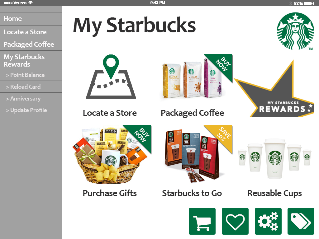 Design Showcase 14 this week had us understanding and designing for the needs of mobile applications, or apps. We were asked to chose a retail location and create a new iPad app with the original iPad app specifications. I selected Starbucks as the brand extends retail both to traditional brick and mortar locations, but also online and via apps for product purchasing, loyalty management, and gift carding.
I started my file with the provided specs of 1024 by 768 and in RGB. Working from top to bottom, I framed out my header with the status bar, and blocked out the left side for my navigation. Below the status bar and to the right, I dropped in the current Starbucks Logo. I also added a headline of “My Starbucks” in a font similar to the one the company uses.
 Next, I added additional grid lines to frame out a six-up layout of options on the primary homescreen. I envisioned each of these to be a primary CTA of a consumer using the app, and placed them in priority of the consumer engagement. Working left to right, top to bottom, I selected images that I felt would be part of a branded app experience, including locating a store, purchasing coffee and products, and managing the “My Starbucks Rewards” loyalty program. I added cordner flags, in both Starbucks green and gold to add a sense of priority to specific retail products.
It was necessary for me to modify the “Locate a Store” icon and to create the “My Starbucks Rewards” star. For the locator icon, I found a general stock image, and then recolored the pin point to Starbucks green. For the MSR star, I draw a five-point star with a fill the standard grey color, and a 5 px. gold stroke that matched the “gold” brand. I then rotated the star, placing into position, and layered in the MSR font logo I’d found. After rasterizing the layer, I used the guides to select and delete the points of the star that fell outside the grid.
Next, I focused on the main navigation, and opted for a text treatment with 1 px. lines to separate. I used a slightly darker font color, font pt. size, and indented with a “>” to illustrate subnavigation.
My last effort was to introduce app icons that I felt would be beneficial to a user throughout the app. The shopping cart was intended for a true virtual in-app cart, the heart for the consumer to identify “favorites” for a specific product, store, etc. The gears to update their profile and/or app settings, and the price tag to be a quick way for a user to navigate to promotions or sales. I distributed the four evenly and placed them in the lower-left corner of the app. I’d envisioned them as a sticking/floating element as a user navigated within the app.
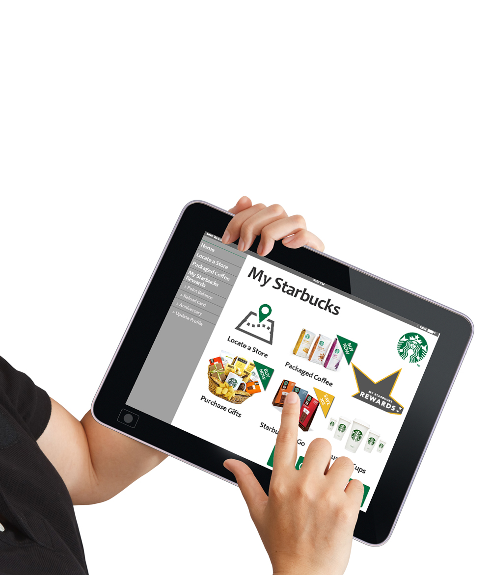
Finally, I adjusted the status bar to reflect the landscape nature of the iPad app, and reversed the color so that it would stand out from darker grey background. I then saved the file for web and placed it into the user mock-up image we had learned in our lecture. Using the magic wand, I erased the white section of the iPad under the woman’s hand, and then placed my web-ready iPad image as a new layer UNDER the current layer. I transformed the image to scale down, and then used Distort to fit it just behind the iPad bevel.
The project overall was an interesting extension of the lessons we’d learned thus far. Having done some design work for mobile sites, the user interface isn’t much different, but the user experience certainly can be. While I don’t believe my app would ever make it to the Starbucks hall of fame, I liked how the different elements came together and the colors played nicely within the app.
Disclaimer: I am in no way affiliated with Starbucks, its parent or subsidiary companies. The creative here is purely for education purposes only. Not for commercial use.
Post Tags:
iPad, Mobile App Design, Perspective, Photoshop, VIC5325,